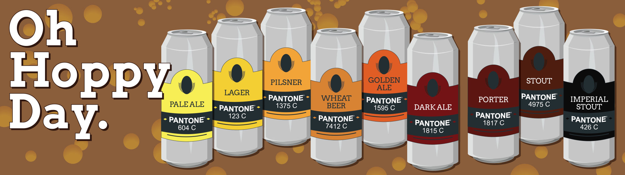
In 1935, the first beer can was introduced to the world and changed the way we consume that delicious, fermented beverage forever. 80 years and 20,000 different brands later, the beer can has become a canvas for some of the most creative (and thirsty) designers out there.
January 24 is National Beer Can Appreciation Day, and to celebrate, we asked the WideNet design team to share with us their favorite beer can artwork. Check out what they came up with!
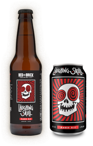
Laughing Skull American Amber Ale
Laughing Skull was originally brewed by Red Brick Brewing for The Vortex restaurant in Atlanta, GA (one of my all time favorite restaurants), and is only available in the Southeast.
The design is of an actual “laughing skull” with large, hypnotic eyes, and being a sucker for anything with a skull on it, this beer immediately grabbed my attention. The use of bold colors really compliment the iconic imagery, and the unique font choice with different letter heights actually remind me of laughter.
This beer is crisp and clean with a smooth flavor and true amber color. It pairs well with almost any food, and it’s light body make it a perfect session beer. Personally the only beer I like is in a chicken, I’m a whiskey girl.
– Melissa Patterson
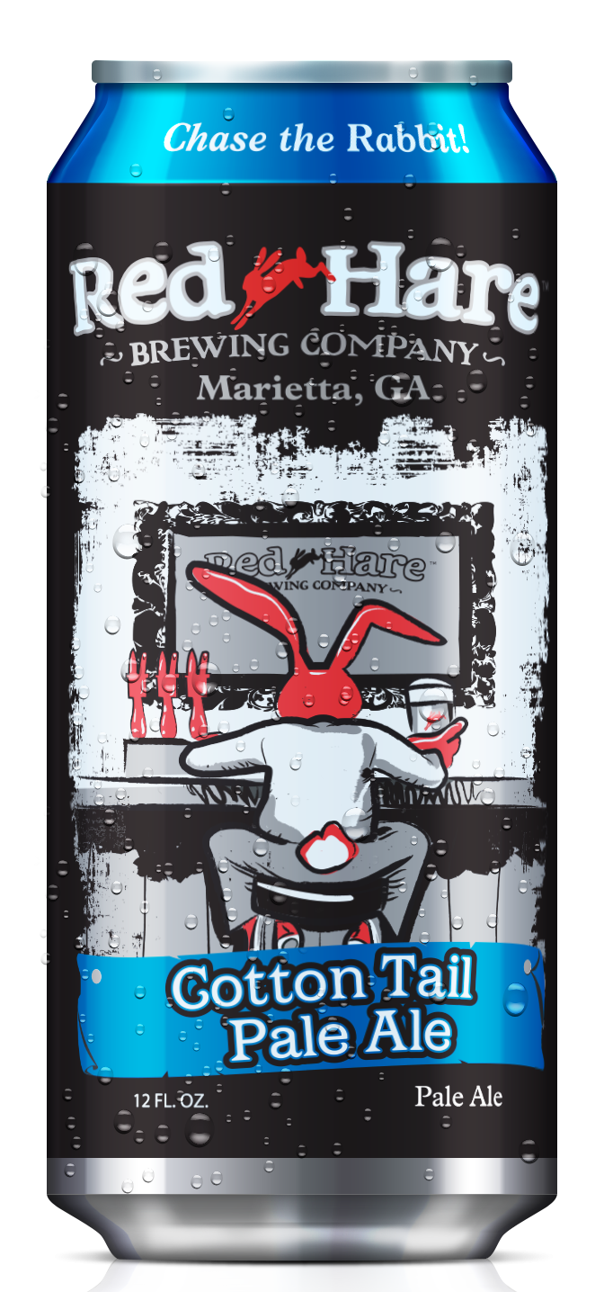
Red Hare Cotton Tail Pale Ale
Red Hare Cotton Tail Pale Ale is a local brew from Marietta, Georgia. I like how the red “hare” from the logo appears in each label design. The whole line of beer labels are great, but this one in particular is my favorite.
I like that the red rabbit is the only color among the black and white design. It gives the label an old comic strip feel. Not to mention, the name Cotton Tail Pale Ale is both a perfect title and clever rhyme.
The sweet and malty backbone of the flavor perfectly balances the slight bitterness of the hop profile, making this a refreshing brew with a clean finish.
– Lori Johns
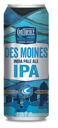
Des Moines India Pale Ale
Given that I am born and raised in Des Moines, Iowa, naturally I would choose a beer can design hailing from this great city!
This design speaks to me in both an aesthetic and heartfelt way. The blue hues and abstract artwork take me right back to my childhood. From childhood memories of riding my bike through the suburbs to driving around “The Loop” and dancing at various teen clubs downtown as teenager, Des Moines was the place to grow up!
The illustrative depiction of the Des Moines skyline is playful, yet clues you in to the natural flavors that are present in this robust and malty brew. The criss-cross lines and shapes at the top of the can are reminiscent of the tied arched bridges that embellish the city’s landscape. A perfect homage to this cosmopolitan and agrarian city.
– Tonya Wilson
Join us in toasting to the beer can. Share with us your favorite design in the comments.